

| Concept
As part of a small design challenge with a coworker, we were tasked with redesigning the National Park Service logo. Some of the problems with the current logo is that there is too much detail and too much going on with the overall look. I tasked myself with keeping the iconic shape, while making the mark cleaner and more simple so that it aligns with the more successful logos we see today.
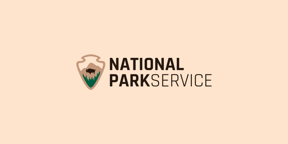
I decided to keep the mountains, trees, and bison in my refreshed logo. Simplifying these items would prove to be important in the final logo. I also decided to revitalize the typeface to Rajdhani because it fits better with the mark, stands out in the middle of all the surrounding elements, and can be used across the brand when needed.

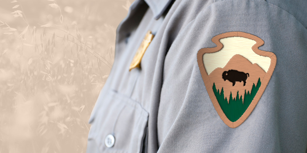
I applied the logo mark to a few items such as a uniform patch, sign, and some collateral. This was my first attempt at creating these items to showcase a logo and how it would be used in the real world. The uniform patch contains a three-dimensional mountain with the sky, trees, and Bison recessed in the background. The patch is a common item on all Park Ranger shirts so this was important to know that the mark could hold its own in that situation.
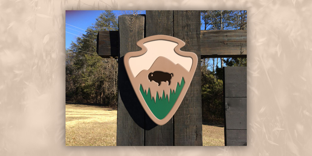
Another important item that is a common place for the logo to appear on is a sign to any National Park. I created the sign to have a plastic appearance and applied it to a wooden post. This item was made to look three-dimensional in order to make the viewer think that it was popping out at them.
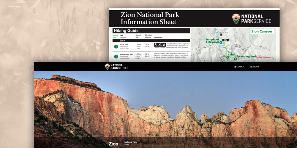
The final item I applied the logo to was a website and Information Sheet or Trail Map. Both are used quite frequently by anyone visiting the national park, doing research in the park or planning a trip to any National Park. Therefore, it was important to make sure the logo also fit on these items.
I believe I succeeded in refreshing the logo to be more modern, while also keeping it recognizable as the National Park Service. I enjoyed creating this mark and applying it to various items to make sure the logo held up for the thousands of people who view this logo every day.
Want to see these images in a larger format, head over to my Dribble to check them out: NPS Logos
If you would like to work with me or ask me a question, send an email to alex@goldenwavecreative.com