

| Concept
When I first approached this project, I wanted to work on designing something I had never done before. The first thing that came to mind was to use a current product or set of products and create a general homepage followed by a detail page of the specific product that the company is selling.
I thought that creating something having to do with either beer or whiskey was an attractive and extremely relevant challenge in 2020. Now that so many people have turned to ordering alcohol online due to the current pandemic, it was a real world project that could easily be implemented immediately. I decided to rework the company website of a local brewery from back in my home state. I wanted this design to stand out over your typical "online stores" while remaining believable and not impractical.
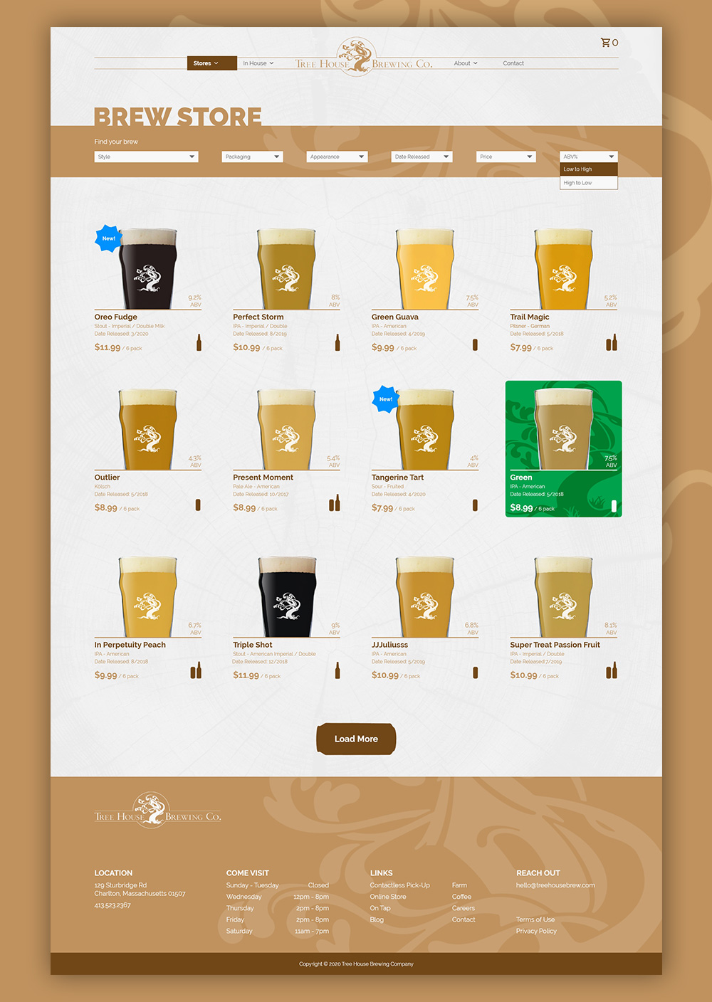
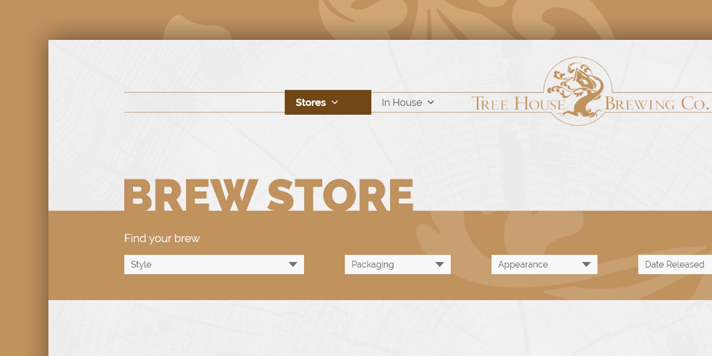
As someone who enjoys a craft beer, I wanted the filtering to target the potential buyer. Characteristics such as style, appearance, and ABV, all play a large part in choosing a beer. Therefore, the filter would help the customer narrow down the beer options to the exact characteristics that they are looking for.
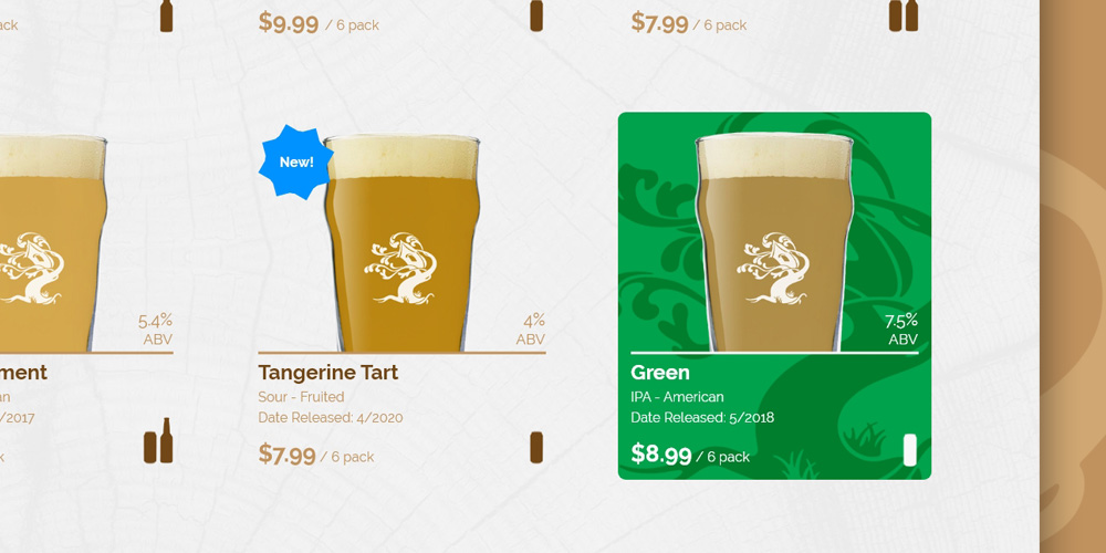
As we zoom into an individual item we are immediately greeted with a visual of the beer in a glass. As someone who tends to enjoy lighter-looking beers, this was an important feature and was also visually appealing on the page. There are other key common characteristics that I included like type, release date, ABV, and price, all of which are things customers think about when purchasing craft beers. Another feature I thought was important to include was a badge to highlight new beers that would be easily visible when glancing at the page. Knowing that many beer lovers enjoy trying out various new brews from their favorite brewery, this badge would allow the brewery to showcase their new brews in a highly visible manner. The last two items included are the type of packaging the beer comes in, (ie. bottles or cans), and a hover state that directly relates to the can or bottle label and color.
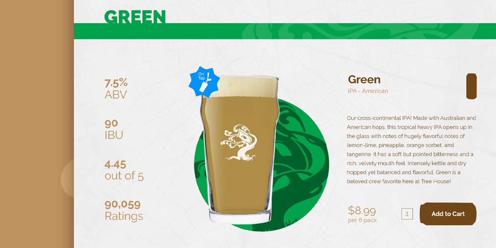
As we move to the detail page, we start to see more of the items you would see on any other product page such as ratings and reviews, product descriptions, and price. Although some buyers may skip over the review section, it can also serve as a useful tool for others who are deciding whether to purchase a specific beer. And here again, we see the type of packaging, ABV, and IBU value of the specific beer that the customer is looking at.
A large part of a brewery's business model is the revenue earned from customers who visit the brewery. Therefore, I added a badge to each product page to let the customer know if it is on tap at the brewery. If a customer is hesitant to buy an entire 6-pack without trying it first, this badge gives them the option of heading to the brewery (obviously only for local customers) and trying the beer out. And vice versa, if a customer buys a six-pack and loves it, they then might have extra incentive to go to the brewery and try a fresh draft in person.
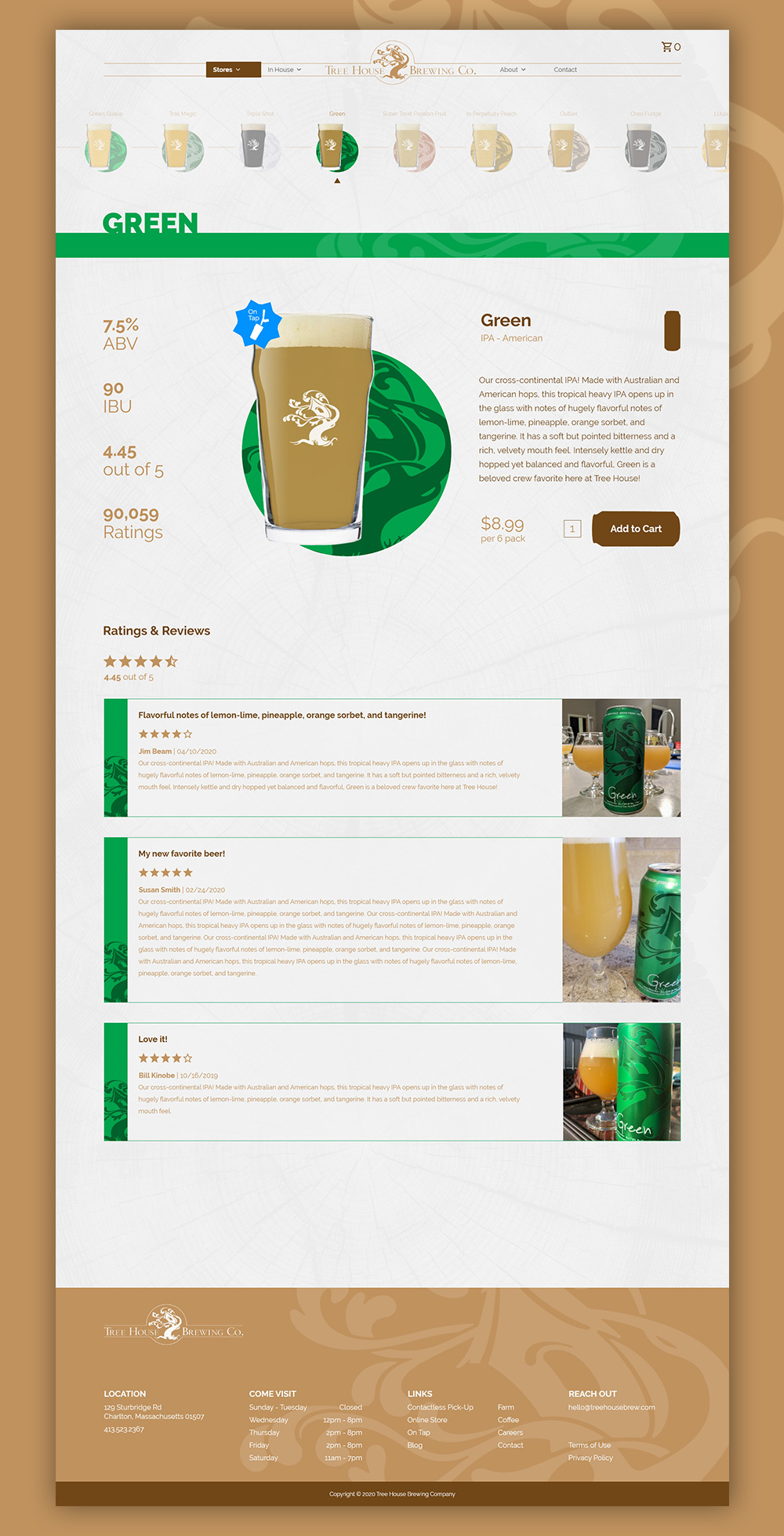
A section of the detail page which I think is a cool feature, is the quick-swap selector. This section at the top of the page shows all of the beers in a horizontal scrolling list that allows the user to easily jump over to another beer without going back to the main listing page. The current selection would be completely opaque while all the other selections would be slightly transparent unless the mouse hovers over it. Also on this page, I included the label coloring, brew in the glass, and name to help the user make a selection.
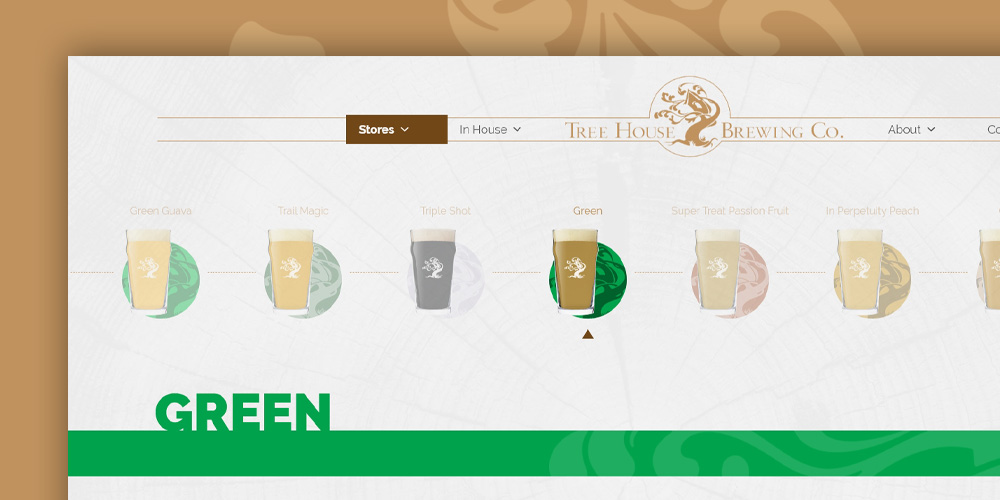
I did my best to keep the detail area clean while still providing enough information to the customer that allows them to make an informed decision on whether that specific beer is right for them. As seen on the listing page, but this time as a permanent item, is the coloring of the label that they would see on the bottle or can. I did this with the hope that the customer would now have a more visual cue to shop for a beer on the website in the event that they couldn't remember the name. For example a customer might say "I think it had a dark green label on it" and by scrolling through the labels, they would be able to identify the beer they liked.
During this project I felt like I learned a lot about the decisions about what to include and exclude when talking about specific products. As someone who does a lot of online shopping now, I thought, "what might be something unique that I could add to make a product list and detail page more interesting, while also being user friendly?" I hope you enjoyed this design and my thought process behind the details and be sure to check out some of my other projects!
If you would like to work with me or ask me a question, send an email to alex@goldenwavecreative.com